
This is the third and final blog post in my series on income inequality (read the other two here and here). This post discusses the detachment of compensation from productivity that occurred around 1973. I look at the data and use R for exploring this break, along with why it may have occurred. R code is with the analysis, in the spirit of reproducible research.
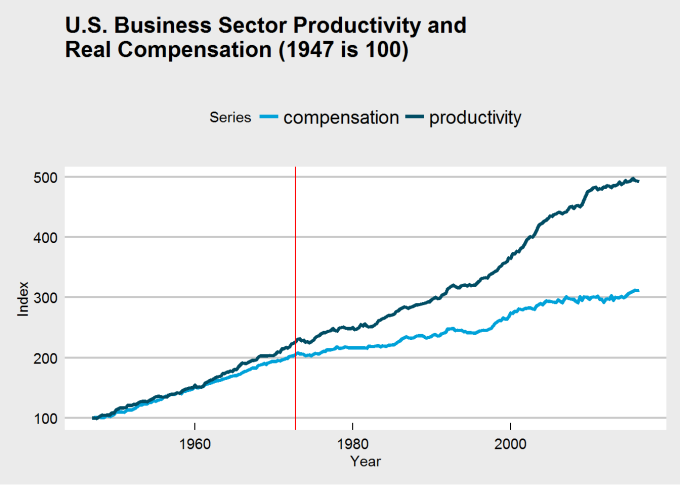
This series on income inequality was originally inspired by this article by Stan Sorscher. We see this chart in the article:
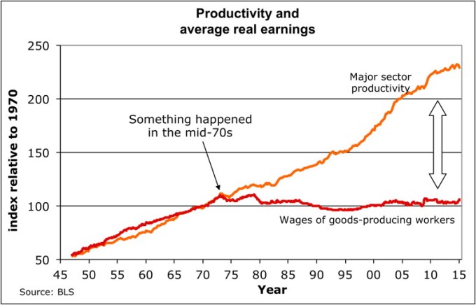
I was stunned when I first saw Dr. Sorscher’s 1 chart. It appears as if something big happened in 1973 to unhinge wages from productivity. The kink in the chart is the smoking gun. Workers from that point on are robbed of the fruit of their labor, yet the chart suggests that somehow this can be fixed, since something did this.
However, Dr. Sorscher claims that no such smoking gun exists. Instead of there being some economic explanation, he waxes on about the loss of shift of American values to a “greed is good” mentality, that the kink of 1973 reflects the point when this shift occurs, and ever since then, capitalists and policy makers simply found it easier and more acceptable to rob the working man of his wages. The fix? Shift the culture back to one where we cared about everyone.
I don’t necessarily disagree with the idea that a shift in the mentality of Americans has occured. Once, the United States was an egalitarian beacon that other nations sought to emulate. The Roosevelts did much to limit corporate power and establish a friendly environment for workers. Then Reagan escalated the Cold War and managed to link anything that would seem to inhibit the workings of free markets with COMMUNISM (gasp) and thus must be reviled. In the process of resisting Communism, we forgot the principles that made us the envy of the world and ensured the majority of Americans a decent living. And I hope someday we remember who we once were.
That said, I disagree with Dr. Sorscher. A kink like the one in 1973 suggests more than his explanation. First, values do not change overnight. Second, claiming a shift in values must be accompanied with some example, and if 1973 is the year the shift occured we should be able to find some event in 1973 that suggests the shift has occured. Finally, claiming that our problems are due to a change in just values is not actionable; values must translate to policy and practice in order to be of any effect, and if we are to fix the problem of stagnating wages and growing inequality, we must identify the policies and practices responsible for the problem in order to fix them.
Thus, I sought to replicate Dr. Sorscher’s results, but in doing so discovered some holes in his analysis, which suggest that perhaps this detachment of wages from productivity may not even have occured. We shall see why below.
(Throughout this post, I will be using R to analyze the datasets relevant to this topic, and the code will be intermixed through the text. For the R coders reading this post, enjoy. For the rest, there is a reason why I do this. I subscribe to the philosophy of reproducible research, which says results and code should be shown simultaneously for both checking and confirming results and also building upon them. If you don’t like code, ignore it. You may still find parts you like.)
Getting the data
Dr. Sorscher’s charts claim to use data from the Bureau of Labor Statistics, one of the most important sources for U.S. economic data. The series in his charts include major sector productivity and wages for workers in goods-producing industries. I did my best to find data matching that in his charts, but unfortunately I was able only to replicate the series on productivity, not the series for wages. That said, I do not feel it fair to use only workers in goods-producing industries and productivity in all major sectors, since this is an apples-to-oranges comparison. So I feel fine about the fact that I use real hourly wages for all major-sector workers rather than those in goods-producing industries.
Instead of just downloading the data directly from the BLS website, I decided to take advantage of the BLS data API and the R implementation of that API. See the code below for how to install the API from GitHub.
# devtools::install_github("mikeasilva/blsAPI")
# API for BLS website
library(blsAPI)
library(rjson)
library(dplyr)

# Because I want to concatenate strings like a python programmer, damnit!
`%s%` <- function(x,y) {paste(x,y)}
`%s0%` <- function(x,y) {paste0(x,y)}
The version of the BLS API I am using restricts the number of years for which you can get data in any given call (why they do this is beyond me). So I get data in batches of five years and create a data frame containing the data set.
series_df <- data.frame("quarter" = list(),"productivity" = list(),"compensation" = list())
for (year in (1947 + 5 * (0:((2016 - 1947)/5)))) {
payload <- list(
'seriesid' = c("PRS84006093","PRS84006153"), # Series ID's
# PRS84006093 is labor productivity (output per hour) in business sector
# PRS84006153 is real hourly compensation in business sector
"startyear" = year,
"endyear" = min(year + 4, 2016),
"registrationKey" = api_key
)
response <- blsAPI(payload, 2) %>% fromJSON # Parse response
# Update data frame with new information
series_df <- bind_rows(series_df, bind_rows(
# Make a data frame with each productivity value for a time point; this will be
# a row that will be joined together into a complete data frame
lapply(response$Results$series[[1]]$data, function(x)
list("quarter" = x$year %s0% x$period, "productivity" = x$value))
# Join with compensation data
) %>% full_join(bind_rows(
# Make a data frame with each compensation value for a time point; this will be
# a row that will be joined together into a complete data frame
lapply(response$Results$series[[2]]$data, function(x)
list("quarter" = x$year %s0% x$period, "compensation" = x$value))
)))
Sys.sleep(5) # Wait 5 seconds before next request
}
series_df <- arrange(series_df, quarter)
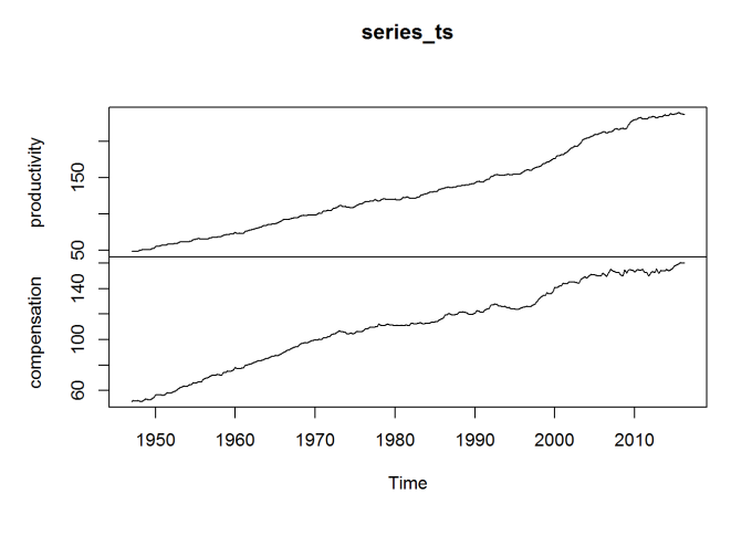
# Create a multivariate time series object
series_ts <- ts(series_df[c("productivity", "compensation")], start = c(1947,1),frequency = 4)
head(series_ts)
##      productivity compensation
## [1,]       21.499       33.407
## [2,]       21.601       33.894
## [3,]       21.407       33.658
## [4,]       21.686       33.936
## [5,]       22.179       33.686
## [6,]       22.633       33.535
plot(series_ts)

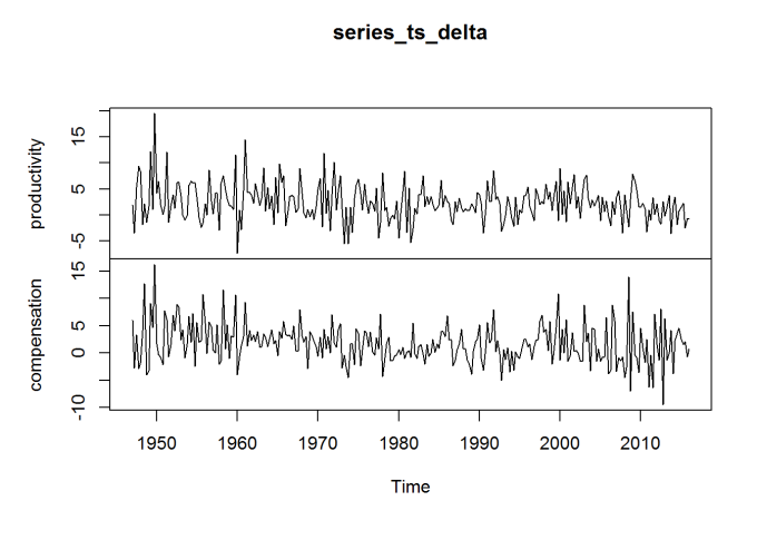
The data above is enough for me to recreate (as close as I can) Dr. Sorscher’s chart, but I will also want to look at the percentage change in these series between quarters. So I repeat the process with two other series, representing these percentage changes. (I would rather use the BLS data directly than compute this myself, to ensure some consistency.)
series_df_delta <- data.frame("quarter" = list(),"productivity" = list(),"compensation" = list())
for (year in (1947 + 5 * (0:((2016 - 1947)/5)))) {
    payload <- list(
        'seriesid' = c("PRS84006092","PRS84006152"), # Series ID's
        # PRS84006092 is % change in labor productivity (output per hour) in business sector since previous quarter
        # PRS84006152 is % change in real hourly compensation in business sector since previous quarter
        "startyear" = year,
        "endyear" = min(year + 4, 2016),
        "registrationKey" = api_key
    )
    response <- blsAPI(payload, 2) %>% fromJSON   # Parse response
    # Update data frame with new information
    series_df_delta <- bind_rows(series_df_delta, bind_rows(
        # Make a data frame with each productivity value for a time point; this will be
        # a row that will be joined together into a complete data frame
        lapply(response$Results$series[[1]]$data, function(x)
            list("quarter" = x$year %s0% x$period, "productivity" = x$value))
        # Join with compensation data
    ) %>% full_join(bind_rows(
        # Make a data frame with each compensation value for a time point; this will be
        # a row that will be joined together into a complete data frame
        lapply(response$Results$series[[2]]$data, function(x)
            list("quarter" = x$year %s0% x$period, "compensation" = x$value))
    )))
    Sys.sleep(5)  # Wait 5 seconds before next request
}
series_df_delta <- arrange(series_df_delta, quarter)

# Create a multivariate time series object
series_ts_delta <- ts(series_df_delta[c("productivity", "compensation")], start = c(1947,1),frequency = 4)
head(series_ts_delta)
##      productivity compensation
## [1,]          1.9          6.0
## [2,]         -3.5         -2.8
## [3,]          5.3          3.3
## [4,]          9.4         -2.9
## [5,]          8.4         -1.8
## [6,]         -1.9          4.1
plot(series_ts_delta)
The data is an index, with 2009 constituting 100. The year 1973 is of special interest, so I reindex to make 1970 the value 100 (for the average) for both series, as done in Dr. Sorscher’s chart.
means_70 <- apply(window(series_ts, start = c(1970,1), end = c(1970,4)),2,mean)
series_ts[,"productivity"] <- series_ts[,"productivity"] / means_70["productivity"] * 100
series_ts[,"compensation"] <- series_ts[,"compensation"] / means_70["compensation"] * 100
plot(series_ts)
Plotting the data
The charts I made earlier are only preliminary. I use ggplot2 to actually make a nice chart comparable to the one near the beginning of this post.
library(ggplot2)
library(ggthemes)   # Nice ggplot2 themes, like the Economist
library(reshape)

plot_df <- melt(series_ts) %>% arrange(X1)
plot_df$X1 <- rep(series_ts %>% time %>% as.vector, each = 2)
names(plot_df) <- c("Year", "Series", "Index")
ggplot(plot_df, aes(x = Year, y = Index, group = Series)) +
    geom_line(aes(color = Series), size = 1.4) +
    ggtitle("U.S. Business Sector Productivity and\nReal Compensation (1973 is 100)") +
    theme_economist_white() +
    scale_color_economist()
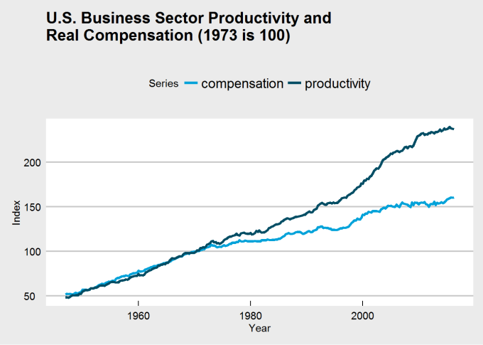
The break in my chart is not as dramatic in Dr. Sorscher’s, and I was unable to find a series for wages that does replicate that dramatic break. There is another problem, though: making 1970 the value 100 guarantees that the two charts will intersect there, which may distort the interpretation of the chart. Choosing that base year to be 100 may be distorting how we view the data. If we were to make 1947 (the beginning of the series) the index value 100, would the chart have the same dramatic break at 1973?
series_ts_47 <- series_ts
series_ts_47[,"productivity"] <- series_ts[,"productivity"] / series_ts[1,"productivity"] * 100
series_ts_47[,"compensation"] <- series_ts[,"compensation"] / series_ts[1,"compensation"] * 100

plot_df_47 <- melt(series_ts_47) %>% arrange(X1)
plot_df_47$X1 <- rep(series_ts_47 %>% time %>% as.vector, each = 2)
names(plot_df_47) <- c("Year", "Series", "Index")
ggplot(plot_df_47, aes(x = Year, y = Index, group = Series)) +
    geom_line(aes(color = Series), size = 1.4) +
    ggtitle("U.S. Business Sector Productivity and\nReal Compensation (1947 is 100)") +
    theme_economist_white() +
    scale_color_economist()

See the difference? It’s clear that the choice of base year was influencing perception of the chart and its data. There may still be a kink around 1973, but if it does exist, it does not appear quite so dramatic. Thus, we may need to rethink the problem and question:
- whether a change occured at all, and
- whether that change occured in 1973.
It’s here that I introduce change point analysis.
Change point analysis and the CUSUM test
Consider the model:
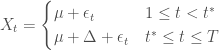
where 


In words, a series centers around a common mean up until an unknown point in time, when the series might suddenly change its mean.
We wish to test:


In words, we test the null hypothesis that no change occurs against the alternative hypothesis that states that the mean does change, though we don’t know where this change occurs.
The problem we have been discussing calls for a test like this. We neither can claim to know whether a change occured nor when it did (if we did know, we could simply use a two-sample t-test). Fortunately, change point analysis is a well-studied problem.
To perform this test, I use the CUSUM statistic:


The limiting distribution of the CUSUM distribution is the distribution of ![\sup_{t\in[0,1]}|B(t)|](https://s0.wp.com/latex.php?latex=%5Csup_%7Bt%5Cin%5B0%2C1%5D%7D%7CB%28t%29%7C&bg=ffffff&fg=444444&s=0&c=20201002)

We thus reject the null hypothesis if 
The functions below allow for implementing the CUSUM test for change in mean.
#include <Rcpp.h>
using namespace Rcpp;

// Function to be wrapped; to be used only in statVn; see a description
// there

// [[Rcpp::export]]
NumericVector statVn_cpp(NumericVector dat, double kn, double tau) {
    double n = dat.size();
    // Get total sum and sum of squares; this will be the "upper sum"
    // (i.e. the sum above k)
    double s_upper = 0, s_square_upper = 0;
    // The "lower sums" (i.e. those below k)
    double s_lower = 0, s_square_lower = 0;
    // Get lower sums
    // Go to kn - 1 to prevent double-counting in main
    // loop
    for (int i = 0; i < kn - 1; ++i) {
        s_lower += dat[i];
        s_square_lower += dat[i] * dat[i];
    }
    // Get upper sum
    for (int i = kn - 1; i < n; ++i) {
        s_upper += dat[i];
        s_square_upper += dat[i] * dat[i];
    }
    // The maximum, which will be returned
    double M = 0;
    // A candidate for the new maximum, used in a loop+
    double M_candidate;
    // Get the complete upper sum
    double s_total = s_upper + s_lower;
    // Estimate for change location
    int est = n;

    // Compute the test statistic
    for (int k = kn; k <= (n - kn); ++k) {
        // Update s and s_square for both lower and upper
        s_lower += dat[k-1];
        s_square_lower += dat[k-1] * dat[k-1];
        s_upper -= dat[k-1];
        s_square_upper -= dat[k-1] * dat[k-1];

        // Get estimate of sd for this k
        double sdk = std::sqrt((s_square_lower - s_lower * s_lower / k +
            s_square_upper - s_upper * s_upper / (n - k))/n);
        M_candidate = std::abs(s_lower - (k / n) * s_total) / sdk /
                        std::pow(k / n * (n - k) / n, tau);
        // Choose new maximum
        if (M_candidate > M) {
            M = M_candidate;
            est = k;
        }
    }
    // Final step; the maximum M should be normalized
    M /= std::sqrt(n);

    return NumericVector::create(M, est);
}
statVn <- function(dat, kn = function(n) {1}, tau = 0, estimate = FALSE) {
    ## Computes the Vn statistic
    ##
    ## :param dat: vector; The data vector
    ## :param kn: function; A function that corresponds to the k_n
    ##      function in the (trimmed) CUSUM variant; by default, is
    ##      a function returning 0 (no trimming)
    ##  :param tau: numeric; The weighting parameter for the
    ##      weighted CUSUM statistc; by default, is 0
    ##  :param estimate: integer; Whether to return the estimated
    ##      location of the change point
    ##
    ## :return: numeric; The resulting test statistic
    ##
    ## This function (written in C++) computes the CUSUM statistic, Vn,
    ## and returns the resulting statistic. Changing the parameters kn
    ## and tau allow for weighted and trimmed variants of the CUSUM
    ## statistic.

    # Here is equivalent (slow) R code
    # n = length(dat)
    # return(n^(-1/2)*max(sapply(
    #     floor(max(kn(n),1)):min(n - floor(kn(n)),n-1), function(k)
    #         (k/n*(1 - k/n))^(-tau)/
    #         sqrt((sum((dat[1:k] -
    #            mean(dat[1:k]))^2)+sum((dat[(k+1):n] -
    #            mean(dat[(k+1):n]))^2))/n)*
    #         abs(sum(dat[1:k]) - k/n*sum(dat))
    # )))

    res <- statVn_cpp(dat, kn(length(dat)), tau)
    names(res) <- c("statistic", "estimate")
    res[2] <- as.integer(res[2])
    if (estimate) {
        return(res)
    } else {
        return(res[[1]])
    }
}

pKolmogorov <- function(q, summands = 500) {
    ## A function for computing the distribution function of sup|B(t)|
    ##
    ## q: numeric; The quantile to compute the probability for
    ## summands: integer; The number of summands to include
    ##    in the sum
    ## (return): numeric; The probability associatecd with
    ##    the quantile.
    ##
    ## This function computes P(K < q), where K is
    ## sup_(0<t<1)|B(t)|. The formula for computing this
    ## is
    ## sqrt(2pi)/x sum_(i=1)^(infty) exp(-(2i-1)^2pi^2/
    ## (8x^2))

    return(sqrt(2*pi)*sapply(q, function(x) { if (x > 0) {
        return(sum(exp(-(2*(1:summands)-1)^2*pi^2/(8*x^2)))/x)
    } else {
        return(0)
    }}))
}

CUSUM.test <- function(x) {
    ## Cleanly performs the CUSUM test
    ##
    ## :param x: numeric; Data to test for changepoint
    ##
    ## :return: htest; List of class htest containing
    ##      test description and results.
    ##
    ## Performs a CUSUM test for change in mean.

    testobj <- list()
    testobj$method <- "CUSUM Test for Change in Mean"
    testobj$data.name <- deparse(substitute(x))

    res <- statVn(x, estimate = TRUE)
    stat <- res[[1]]
    est <- res[[2]]
    attr(stat, "names") <- "A"
    attr(est, "names") <- "t*"
    testobj$p.value <- 1 - pKolmogorov(res[1])
    testobj$estimate <- est
    testobj$statistic <- stat

    class(testobj) <- "htest"
    return(testobj)
}
Results
Since the data trends, we apply the CUSUM test for change in mean to the percentage change between quarters. Thus, we are testing whether the rate of increase of productivity and compensation changes during the period in question. The results of the test are below:
apply(series_ts_delta, 2, CUSUM.test)
## $productivity
##
##  CUSUM Test for Change in Mean
##
## data:  newX[, i]
## A = 1.7258, p-value = 0.005178
## sample estimates:
##  t*
## 104
##
##
## $compensation
##
##  CUSUM Test for Change in Mean
##
## data:  newX[, i]
## A = 2.154, p-value = 0.0001867
## sample estimates:
##  t*
## 104
time(series_ts_delta)[104]
## [1] 1972.75
It seems that the best estimate for the location of the change is Q3 1972, so we can say that the change occured around 1973. That said, notice that both productivity and compensation changed at that time, not just compensation.
I now estimate the growth rates of both series before and after the change
apply(series_ts_delta[1:103,], 2, mean)
## productivity compensation
##     3.311650     2.900971
apply(series_ts_delta[-c(1:103),], 2, mean)
## productivity compensation
##     1.847126     1.016667
Productivity growth dropped from 3.3% a quarter to 1.8% a quarter, and compensation (wage) growth dropped from 2.9% a quarter to 1% a quarter. A large drop for both series.
We can check for other change points by considering the data sets broken at the change point to be two separate data sets, and then reapply the test:
apply(series_ts_delta[1:103,], 2, CUSUM.test) # Changes before 1973?
## $productivity
##
##  CUSUM Test for Change in Mean
##
## data:  newX[, i]
## A = 0.50499, p-value = 0.9607
## sample estimates:
## t*
## 18
##
##
## $compensation
##
##  CUSUM Test for Change in Mean
##
## data:  newX[, i]
## A = 0.67167, p-value = 0.7577
## sample estimates:
## t*
## 52
apply(series_ts_delta[-c(1:103),], 2, CUSUM.test) # Changes after 1973?
## $productivity
##
##  CUSUM Test for Change in Mean
##
## data:  newX[, i]
## A = 0.88028, p-value = 0.4205
## sample estimates:
##  t*
## 148
##
##
## $compensation
##
##  CUSUM Test for Change in Mean
##
## data:  newX[, i]
## A = 0.5727, p-value = 0.8982
## sample estimates:
## t*
## 91
There is no evidence for other change points. 1973 is special.
It looks as if productivity growth dropped by half and compensation growth dropped to a third, but can we say that they detached, as Dr. Sorscher claims? To investigate this, I look at the series of differences between productivity growth and compensation growth.
CUSUM.test(series_ts_delta[,"productivity"] - series_ts_delta[,"compensation"])
##
##  CUSUM Test for Change in Mean
##
## data:  series_ts_delta[,"productivity"] - series_ts_delta[,"compensation"]
## A = 0.56933, p-value = 0.9021
## sample estimates:
## t*
## 92
The CUSUM test fails to reject the null hypothesis of no change, with no room for ambiguity. It does not appear that the two series detached.
Concluding discussion
Here is the new and improved chart with the location of the change highlighted by a red line.
ggplot(plot_df_47, aes(x = Year, y = Index, group = Series)) +
    geom_line(aes(color = Series), size = 1.4) +
    ggtitle("U.S. Business Sector Productivity and\nReal Compensation (1947 is 100)") +
    theme_economist_white() +
    scale_color_economist() +
    geom_vline(xintercept = time(series_ts_delta)[104], color = "red")
It’s difficult to see, but both series have changed after 1973, and the above analysis suggests they are both growing slower. Productivity growth was already growing faster than compensation, and even if the 1973 break had not occured, we would still likely see a large gap between the series at the end of the chart. A Marxist would tell you this is consistent with how capitalism operates; the capitalist class does not fully compensate its workers, never has, and never will. There will always be a discrepancy between productivity and compensation for as long as capitalism is our economic system.
That said, why did the break of 1973 (or Q3 1972, if you prefer) occur? Let’s first answer: did the break occur because of a drop in productivity growth, or because of a drop in compensation growth? Now there is a conundrum that I will not be able to answer in a blog post. There is, in all honesty, no way to tell.
Can we point to an event that might cause a break in either? Well, Richard Nixon was elected President that year. He was a Republican, so he must have done something to do with it. But not only did Nixon have to deal with a Democratically-run Congress throughout his administration, Nixon was an older generation of Republicans and a political era when ideology hardly defined political allegiance. Nixon wanted to end the war in Vietnam, opened relations with China, and, aside from wanting to delegate more decision-making power to the states, did not have an economic policy we would associate with Republicans today. In fact, Nixon supported the Equal Rights Amendment (intended to make gender equality a Constitutionally-guaranteed right) and created the Environmental Protection Agency so hated by Republicans today (along with other environmental reforms). Watergate had nothing to do with the economy; we can’t pin the blame on him.
What about GATT? 1973 saw a new round of GATT negotiations, the Tokyo round, that further liberalized trade, dropping nations tariffs. This might be closer to the cause, but I’m not convinced.
How about the wave of deregulation that began in the 1970s? Unfortunately, this started in the late 1970s, and didn’t escalate to full-blown dismantlement of regulatory structures until Ronald Regan took office. In fact, Regan is the best evidence of the shift Dr. Sorscher claims tood place, though this happens much later than Dr. Sorscher claim.
In truth, I don’t have an answer as to why this break occured in 1973. It could have been GATT, the conclusion of the Vietnam War, deregulation, or a number of other causes. That said, I do consider this an interesting question, hopefully one that will someday be answered with satisfaction. And perhaps in answering it we will find a solution to the growing inequality that continues to plague us.
- Dr. Sorscher has a PhD from UC Berkeley in biophysics, and is a board member of the Economic Opportunity Institute, for whom he wrote his article. ↩

The BLS web site is not particularly intuitive. The wage data in the figure come from BLS Series ID CES0600000008. The data can be retrieved at http://data.bls.gov/cgi-bin/srgate
Other data series with the same features can be found at
http://www.huffingtonpost.com/stan-sorscher/we-decide-how-to-share-ga_b_3185721.html
LikeLiked by 1 person
Thank you for telling me the BLS series, and for reading my post. I appreciate it.
I looked at the BLS chart for the series you showed and it doesn’t look quite like the one you posted (the BLS chart still shows wages increasing, while yours makes it appear that they are stagnant). Why is that?
LikeLike
My figure shows “real wages,” which is “then-year” wages adjusted for inflation. I used CPI-W to convert
LikeLiked by 1 person
I’ve recently been thinking about how personal productivity (at work and in our personal lives) has changed since I was a kid and if this is the root cause of some of our mental health issues and the incidence increasing over time.
Also, when did corporate tax rates start to decline and personal ones start to increase (trickle down economics). I think it was the 70’s but can’t remember the exact timing. Could this be a contributing factor?
LikeLike
OMB Historical tables, particularly Table 2.1 and 2.2 show a gradual and substantial shift away from corporate taxes as a percentage of all federal revenue. Personal taxes and payroll taxes grew dramatically.
https://www.whitehouse.gov/omb/historical-tables/
That does not explain what happened in 1973.
1973 marked the transition from Great Society-New Deal governance to neoliberalism.
https://en.wikipedia.org/wiki/Neoliberalism
This was really a shift in social, political and economic power in favor of the 1% and corporations, particularly global corporations. It coincided with a shift in social values from “we all do better when we all do better,” to “I can do better at your expense.”
LikeLiked by 1 person
what about the 1st oil price shock in 1973? also the bretton woods system fell appart in 1971.
LikeLiked by 1 person
— what about the 1st oil price shock in 1973? also the bretton woods system fell appart in 1971.
I was about to say that, but came second. the shift from labour to capital is easiest to explain by events, not data. the Arab oil embargo let loose the dogs of inflation, which led to Volker’s rocket ship interest rates, which led to wage destruction (net value). B-W loosened, for a time, the US’s control of the international monetary system, which has been, de facto, restored in recent years (Treasuries are at 1.5%, or thereabouts, because they are the asset of last resort).
the rise of the Right Wing was in full swing by 1973, irregardless of oil. the supreme court’s shift right, Burger (1969) thence Rehnquist/Roberts, has led to wage destruction and corporate profligacy. the loosening of trade restrictions enabled corporations to exploit Eastern wage slavery; Nixon’s “Opening China” (1972) was not about new markets but about new supply of cheap labour.
— Once, the United States was an egalitarian beacon that other nations sought to emulate. The Roosevelts did much to limit corporate power and establish a friendly environment for workers.
OK, this is the essence. the generation of WWII exemplified a tribal, “we’re all in this together” ethos. by the mid 1970’s, those leaders were well on the way out of power, both political and economic. the generation that grew up during WWII, but did not participate, but read Rand began to take over. it’s no accident that wealth and income equality (for white people, at least) were at historical highs during the 1950s and 1960s; the ethos persisted for that generation. then white people got angry, and blamed everybody but themselves, embracing the right wing. it’s been downhill ever since, and those white people still want to blame “the others” rather than admitting they’d been flummoxed by propagandists.
LikeLike
Although Nixon cancelled the direct international convertibility of the United States dollar into gold, it was not until 1973 when the Bretton Woods system was replaced with the current system of freely floating fiat currencies. I wonder if the the adoption of fiat currencies and the expansion of the welfare state has reduced real wages despite improving productivity?
LikeLike
— I wonder if the the adoption of fiat currencies and the expansion of the welfare state has reduced real wages despite improving productivity?
no. we’ve little, mostly no, evidence of improving productivity. for a manufacturing economy, productivity is a real variable and can be measured. in a (mostly, financial) services economy, productivity is a ghost. whether a faster Xbox means a more productive economy? not so much. remember what generated The Great Recession: a tsunami of money into residential real estate after the previous tsunami blew up the DotBomb. real estate isn’t a producing asset; return is derived from the mortgagees’ rising income. since there wasn’t any of the latter (one can look it up), it all turned out to be a Ponzi scheme. then the London Whale and LIBOR scandal and on and on.
LikeLike
There was some discussion on Reddit about the 1973 oil shock: see https://redd.it/52eupx Basically I’m not taking a stance on the oil shock, though I lean towards Dr. Sorscher’s opinion that it probably is not responsible. Although I mentioned that if international equivalents of the series I used here were to show a similar break, the case for some international event would grow. That said, I see the oil shock as a shock, while the data suggests not merely a shock but a full regime change.
No stance on Bretton-Woods, but I lean no.
LikeLike
very related to what David Harvey explains (with apples) in his book called “A Brief History of Neoliberalism”. Also 1973 was the year of the coup in Chile and a long dictatorship in order to implement the new neoliberal policies and then replicated in many others nations. I guess US is not a different history!
LikeLike
Curtis thanks for the article and code. I finished college and military service and entered the workforce in 1972, and retired earlier this year. And came to your article via my interest in learning the R language. I claim to not know much about economics but I wonder if automation, computers, robotics may have had a positive impact on productivity rather than better workers.
It seems to me that instead of greedy capitalists keeping the increases to themselves, they may have spent it on automation and capital rather than labor. Over my working years everything changed because of computers. 1973 saw a huge increase in IT due to minicomputers, and 10 years later personal computers began to take hold, and now we see computers in almost every machine, and bulk computing and storage have companies like Amazon’s AWS taking in a lot of money.
Would it be proper to look for correlations between automation and productivity?
Thanks again for the article and sharing your code.
Joel Berman
LikeLike
I’m glad you enjoyed my article! Thanks for your comments.
Automation would be measurable only through a survey, and I wonder how it would be defined exactly. I am not aware of any studies about this, but I’ve never looked; I bet they exist.
I think it’s certainly true that technological innovation and increasing deployment of said innovation in workplaces can depress workers bargaining power without harming productivity, since more work can be done with fewer workers. There is a looming crisis prompted by automation that at best demands we figure out how to handle people who have been displaced by it, and at worst questions the value of human beings when any task can be accomplished better by a machine, and their role in what might be a post-human (or mostly post-human) economy. This latter scenario should be taken seriously even if not every job can be automated, just most of them (I don’t believe everyone is cut out to be a computer programmer or mathematician and that’s fine, and there’s enough starving artists as it is). Furthermore, it’s coming faster than we realize; the transportation sector is the largest in every economy (30% of workers, I think), and almost everyone in it is threatened by Google cars.
I don’t consider this an anti-automation sentiment because automation, in my view, is inevitable. But we may be forced to question the fundamental ideas upon which our economy is built and restructure it so everyone can have a good life in this new regime.
LikeLike
So we can see autonomous vehicles displacing all sorts of truckers, taxi/uber, etc. We can see 3D printing displacing many manufacturing and inventory management jobs. We can see online courses displacing teachers. Further along we can see the equivalent of 3D printers synthesizing food, medicine, clothing displacing even more jobs. I think it is all good news. When one flies coast to coast across the USA at night, one sees much more uninhabited space than the brightly lit areas of dense population, so we have plenty of room before Malthusian economics bites us.
My dream would be to see more people creating art, music, philosophy and less people digging ditches and picking crops.
The value has moved from the farmers, to the makers of tractors and combines, to the makers of genetically modified seeds and insecticides. Knowledge. I am almost 70 and only now do I have the time to exercise, read, play and think. I think shorter work weeks would have been nice.
The rate of adoption of tech has a much higher velocity now. The chart at https://hbr.org/resources/images/article_assets/2013/11/consumptionspreads.gif says it well.
It is all about velocity.
LikeLiked by 1 person
I don’t think technological innovation is a bad thing (not that it would matter, because it would happen no matter what). I do think, though, that we will need to rethink how our economy works as progress accelerates.
LikeLike
Joel, I’ve thought the same thing you have in that technology has been driving the disconnect, but I have never seen an inflection point as presented in this article. Could it have been the development of LSI Integrated circuits in 1971 and a shift away from transistors? (https://en.wikipedia.org/wiki/Integrated_circuit).
There’s some great charts at https://ourworldindata.org/technological-progress/ that show charts on technological progress during the 20th century
LikeLike
First off Great post. I appreciate the R coding attached.
What about the drop in top-line marginal tax rates. The first set of tax breaks post WW2 came in the mid 60’s and kept going all the way through the 90’s. Maybe the “greed is good” signal was generated from our own policies encouraging wealth generation.
LikeLike
this just showed up in my newsfeed: http://tinyurl.com/jx5tfv8
of interest to this thread is confirmation of the ground fact as shown in the graph toward the bottom: as the US economy slipped ever further into (financial) services, measured productivity has declined. dueling data, and not for the first time in macro.
LikeLike
Nice detail of productivity since the 70’s.
LikeLike
Reblogged this on financebrilliance and commented:
What a great piece by Curtis Miller.
LikeLike
wage-productivity concordance reflects labor’s bargaining power relative to capital. Decreased role of unions, socio-political shift to the right, supply side economics, globalization (capital freely mobile, but labor isn’t), prolonged periods of high unemployment, etc all increase capital’s power relative to labor. Basically, capital owners are robbing wage earners just because they can, and labor has no recourse.
LikeLiked by 1 person
Very thought-provoking, thank you for sharing. On the code I have a question regarding the function for the CUMSUM test.
As I see it, you’re using some C++ code also, how do you “integrate” that code to be used by the R code? Specifically how do you “wrap” the following: #include ? Just source from a different file or how?
Thanks!
LikeLike
Hello Eduardo! Glad you enjoyed my post.
The C++ code uses Rcpp, which I suggest you look into. The way the block is written, you could write a separate .cpp file, and to get the function statVn_cpp() into R, you would call sourceCpp(“MyFile.cpp”) (which is a part of Rcpp). The C++ comment
// [[Rcpp::export]]
is what tells Rcpp that the function is to be made available in R.
Read Rcpp documentation for more details. Here is a good start: https://www.jstatsoft.org/article/view/v040i08
LikeLike
thanks, makes it clearer!
LikeLike