
THIS POST IS OUT OF DATE: AN UPDATE OF THIS POST’S INFORMATION IS AT THIS LINK HERE! (Also I bet that WordPress.com just garbled the code in this post.)
I’m keeping this post up for the sake of preserving a record.
This post is the first in a two-part series on stock data analysis using Python, based on a lecture I gave on the subject for MATH 3900 (Data Science) at the University of Utah. In these posts, I will discuss basics such as obtaining the data from Yahoo! Finance using pandas, visualizing stock data, moving averages, developing a moving-average crossover strategy, backtesting, and benchmarking. The final post will include practice problems. This first post discusses topics up to introducing moving averages.
NOTE: The information in this post is of a general nature containing information and opinions from the author’s perspective. None of the content of this post should be considered financial advice. Furthermore, any code written here is provided without any form of guarantee. Individuals who choose to use it do so at their own risk.
Introduction
Advanced mathematics and statistics has been present in finance for some time. Prior to the 1980s, banking and finance were well known for being “boring”; investment banking was distinct from commercial banking and the primary role of the industry was handling “simple” (at least in comparison to today) financial instruments, such as loans. Deregulation under the Reagan administration, coupled with an influx of mathematical talent, transformed the industry from the “boring” business of banking to what it is today, and since then, finance has joined the other sciences as a motivation for mathematical research and advancement. For example one of the biggest recent achievements of mathematics was the derivation of the Black-Scholes formula, which facilitated the pricing of stock options (a contract giving the holder the right to purchase or sell a stock at a particular price to the issuer of the option). That said, bad statistical models, including the Black-Scholes formula, hold part of the blame for the 2008 financial crisis.
In recent years, computer science has joined advanced mathematics in revolutionizing finance and trading, the practice of buying and selling of financial assets for the purpose of making a profit. In recent years, trading has become dominated by computers; algorithms are responsible for making rapid split-second trading decisions faster than humans could make (so rapidly, the speed at which light travels is a limitation when designing systems). Additionally, machine learning and data mining techniques are growing in popularity in the financial sector, and likely will continue to do so. In fact, a large part of algorithmic trading is high-frequency trading (HFT). While algorithms may outperform humans, the technology is still new and playing in a famously turbulent, high-stakes arena. HFT was responsible for phenomena such as the 2010 flash crash and a 2013 flash crash prompted by a hacked Associated Press tweet about an attack on the White House.
This lecture, however, will not be about how to crash the stock market with bad mathematical models or trading algorithms. Instead, I intend to provide you with basic tools for handling and analyzing stock market data with Python. I will also discuss moving averages, how to construct trading strategies using moving averages, how to formulate exit strategies upon entering a position, and how to evaluate a strategy with backtesting.
DISCLAIMER: THIS IS NOT FINANCIAL ADVICE!!! Furthermore, I have ZERO experience as a trader (a lot of this knowledge comes from a one-semester course on stock trading I took at Salt Lake Community College)! This is purely introductory knowledge, not enough to make a living trading stocks. People can and do lose money trading stocks, and you do so at your own risk!
Getting and Visualizing Stock Data
Getting Data from Yahoo! Finance with pandas
Before we play with stock data, we need to get it in some workable format. Stock data can be obtained from Yahoo! Finance, Google Finance, or a number of other sources, and the pandas package provides easy access to Yahoo! Finance and Google Finance data, along with other sources. In this lecture, we will get our data from Yahoo! Finance.
The following code demonstrates how to create directly a DataFrame object containing stock information. (You can read more about remote data access here.)
import pandas as pd
import pandas.io.data as web   # Package and modules for importing data; this code may change depending on pandas version
import datetime

# We will look at stock prices over the past year, starting at January 1, 2016
start = datetime.datetime(2016,1,1)
end = datetime.date.today()

# Let's get Apple stock data; Apple's ticker symbol is AAPL
# First argument is the series we want, second is the source ("yahoo" for Yahoo! Finance), third is the start date, fourth is the end date
apple = web.DataReader("AAPL", "yahoo", start, end)

type(apple)
C:\Anaconda3\lib\site-packages\pandas\io\data.py:35: FutureWarning:
The pandas.io.data module is moved to a separate package (pandas-datareader) and will be removed from pandas in a future version.
After installing the pandas-datareader package (https://github.com/pydata/pandas-datareader), you can change the import ``from pandas.io import data, wb`` to ``from pandas_datareader import data, wb``.
  FutureWarning)


pandas.core.frame.DataFrame
apple.head()
| Open | High | Low | Close | Volume | Adj Close | |
|---|---|---|---|---|---|---|
| Date | ||||||
| 2016-01-04 | 102.610001 | 105.370003 | 102.000000 | 105.349998 | 67649400 | 103.586180 |
| 2016-01-05 | 105.750000 | 105.849998 | 102.410004 | 102.709999 | 55791000 | 100.990380 |
| 2016-01-06 | 100.559998 | 102.370003 | 99.870003 | 100.699997 | 68457400 | 99.014030 |
| 2016-01-07 | 98.680000 | 100.129997 | 96.430000 | 96.449997 | 81094400 | 94.835186 |
| 2016-01-08 | 98.550003 | 99.110001 | 96.760002 | 96.959999 | 70798000 | 95.336649 |
Let’s briefly discuss this. Open is the price of the stock at the beginning of the trading day (it need not be the closing price of the previous trading day), high is the highest price of the stock on that trading day, low the lowest price of the stock on that trading day, and close the price of the stock at closing time. Volume indicates how many stocks were traded. Adjusted close is the closing price of the stock that adjusts the price of the stock for corporate actions. While stock prices are considered to be set mostly by traders, stock splits (when the company makes each extant stock worth two and halves the price) and dividends (payout of company profits per share) also affect the price of a stock and should be accounted for.
Visualizing Stock Data
Now that we have stock data we would like to visualize it. I first demonstrate how to do so using the matplotlib package. Notice that the apple DataFrame object has a convenience method, plot(), which makes creating plots easier.
import matplotlib.pyplot as plt   # Import matplotlib
# This line is necessary for the plot to appear in a Jupyter notebook
%matplotlib inline
# Control the default size of figures in this Jupyter notebook
%pylab inline
pylab.rcParams['figure.figsize'] = (15, 9)   # Change the size of plots

apple["Adj Close"].plot(grid = True) # Plot the adjusted closing price of AAPL
Populating the interactive namespace from numpy and matplotlib

A linechart is fine, but there are at least four variables involved for each date (open, high, low, and close), and we would like to have some visual way to see all four variables that does not require plotting four separate lines. Financial data is often plotted with a Japanese candlestick plot, so named because it was first created by 18th century Japanese rice traders. Such a chart can be created with matplotlib, though it requires considerable effort.
I have made a function you are welcome to use to more easily create candlestick charts from pandas data frames, and use it to plot our stock data. (Code is based off this example, and you can read the documentation for the functions involved here.)
from matplotlib.dates import DateFormatter, WeekdayLocator,\
    DayLocator, MONDAY
from matplotlib.finance import candlestick_ohlc

def pandas_candlestick_ohlc(dat, stick = "day", otherseries = None):
    """
    :param dat: pandas DataFrame object with datetime64 index, and float columns "Open", "High", "Low", and "Close", likely created via DataReader from "yahoo"
    :param stick: A string or number indicating the period of time covered by a single candlestick. Valid string inputs include "day", "week", "month", and "year", ("day" default), and any numeric input indicates the number of trading days included in a period
    :param otherseries: An iterable that will be coerced into a list, containing the columns of dat that hold other series to be plotted as lines

    This will show a Japanese candlestick plot for stock data stored in dat, also plotting other series if passed.
    """
    mondays = WeekdayLocator(MONDAY)        # major ticks on the mondays
    alldays = DayLocator()              # minor ticks on the days
    dayFormatter = DateFormatter('%d')      # e.g., 12

    # Create a new DataFrame which includes OHLC data for each period specified by stick input
    transdat = dat.loc[:,["Open", "High", "Low", "Close"]]
    if (type(stick) == str):
        if stick == "day":
            plotdat = transdat
            stick = 1 # Used for plotting
        elif stick in ["week", "month", "year"]:
            if stick == "week":
                transdat["week"] = pd.to_datetime(transdat.index).map(lambda x: x.isocalendar()[1]) # Identify weeks
            elif stick == "month":
                transdat["month"] = pd.to_datetime(transdat.index).map(lambda x: x.month) # Identify months
            transdat["year"] = pd.to_datetime(transdat.index).map(lambda x: x.isocalendar()[0]) # Identify years
            grouped = transdat.groupby(list(set(["year",stick]))) # Group by year and other appropriate variable
            plotdat = pd.DataFrame({"Open": [], "High": [], "Low": [], "Close": []}) # Create empty data frame containing what will be plotted
            for name, group in grouped:
                plotdat = plotdat.append(pd.DataFrame({"Open": group.iloc[0,0],
                                            "High": max(group.High),
                                            "Low": min(group.Low),
                                            "Close": group.iloc[-1,3]},
                                           index = [group.index[0]]))
            if stick == "week": stick = 5
            elif stick == "month": stick = 30
            elif stick == "year": stick = 365

    elif (type(stick) == int and stick >= 1):
        transdat["stick"] = [np.floor(i / stick) for i in range(len(transdat.index))]
        grouped = transdat.groupby("stick")
        plotdat = pd.DataFrame({"Open": [], "High": [], "Low": [], "Close": []}) # Create empty data frame containing what will be plotted
        for name, group in grouped:
            plotdat = plotdat.append(pd.DataFrame({"Open": group.iloc[0,0],
                                        "High": max(group.High),
                                        "Low": min(group.Low),
                                        "Close": group.iloc[-1,3]},
                                       index = [group.index[0]]))

    else:
        raise ValueError('Valid inputs to argument "stick" include the strings "day", "week", "month", "year", or a positive integer')


    # Set plot parameters, including the axis object ax used for plotting
    fig, ax = plt.subplots()
    fig.subplots_adjust(bottom=0.2)
    if plotdat.index[-1] - plotdat.index[0] < pd.Timedelta('730 days'):
        weekFormatter = DateFormatter('%b %d')  # e.g., Jan 12
        ax.xaxis.set_major_locator(mondays)
        ax.xaxis.set_minor_locator(alldays)
    else:
        weekFormatter = DateFormatter('%b %d, %Y')
    ax.xaxis.set_major_formatter(weekFormatter)

    ax.grid(True)

    # Create the candelstick chart
    candlestick_ohlc(ax, list(zip(list(date2num(plotdat.index.tolist())), plotdat["Open"].tolist(), plotdat["High"].tolist(),
                      plotdat["Low"].tolist(), plotdat["Close"].tolist())),
                      colorup = "black", colordown = "red", width = stick * .4)

    # Plot other series (such as moving averages) as lines
    if otherseries != None:
        if type(otherseries) != list:
            otherseries = [otherseries]
        dat.loc[:,otherseries].plot(ax = ax, lw = 1.3, grid = True)

    ax.xaxis_date()
    ax.autoscale_view()
    plt.setp(plt.gca().get_xticklabels(), rotation=45, horizontalalignment='right')

    plt.show()

pandas_candlestick_ohlc(apple)
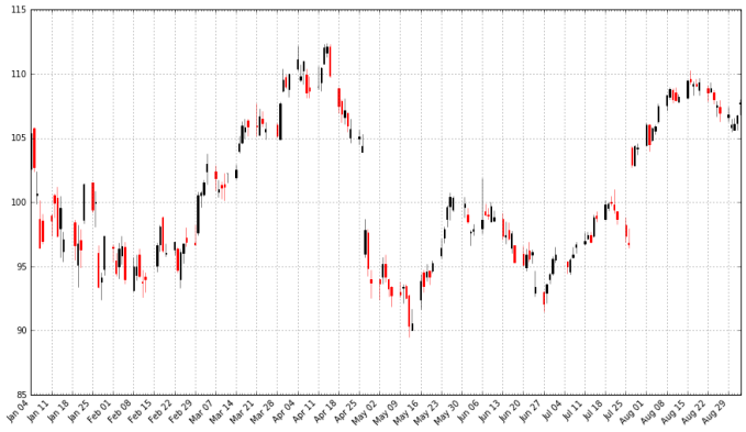
With a candlestick chart, a black candlestick indicates a day where the closing price was higher than the open (a gain), while a red candlestick indicates a day where the open was higher than the close (a loss). The wicks indicate the high and the low, and the body the open and close (hue is used to determine which end of the body is the open and which the close). Candlestick charts are popular in finance and some strategies in technical analysis use them to make trading decisions, depending on the shape, color, and position of the candles. I will not cover such strategies today.
We may wish to plot multiple financial instruments together; we may want to compare stocks, compare them to the market, or look at other securities such as exchange-traded funds (ETFs). Later, we will also want to see how to plot a financial instrument against some indicator, like a moving average. For this you would rather use a line chart than a candlestick chart. (How would you plot multiple candlestick charts on top of one another without cluttering the chart?)
Below, I get stock data for some other tech companies and plot their adjusted close together.
microsoft = web.DataReader("MSFT", "yahoo", start, end)
google = web.DataReader("GOOG", "yahoo", start, end)

# Below I create a DataFrame consisting of the adjusted closing price of these stocks, first by making a list of these objects and using the join method
stocks = pd.DataFrame({"AAPL": apple["Adj Close"],
                      "MSFT": microsoft["Adj Close"],
                      "GOOG": google["Adj Close"]})

stocks.head()
| AAPL | GOOG | MSFT | |
|---|---|---|---|
| Date | |||
| 2016-01-04 | 103.586180 | 741.840027 | 53.696756 |
| 2016-01-05 | 100.990380 | 742.580017 | 53.941723 |
| 2016-01-06 | 99.014030 | 743.619995 | 52.961855 |
| 2016-01-07 | 94.835186 | 726.390015 | 51.119702 |
| 2016-01-08 | 95.336649 | 714.469971 | 51.276485 |
stocks.plot(grid = True)
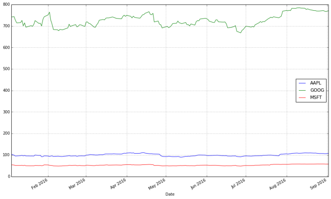
What’s wrong with this chart? While absolute price is important (pricy stocks are difficult to purchase, which affects not only their volatility but your ability to trade that stock), when trading, we are more concerned about the relative change of an asset rather than its absolute price. Google’s stocks are much more expensive than Apple’s or Microsoft’s, and this difference makes Apple’s and Microsoft’s stocks appear much less volatile than they truly are.
One solution would be to use two different scales when plotting the data; one scale will be used by Apple and Microsoft stocks, and the other by Google.
stocks.plot(secondary_y = ["AAPL", "MSFT"], grid = True)

A “better” solution, though, would be to plot the information we actually want: the stock’s returns. This involves transforming the data into something more useful for our purposes. There are multiple transformations we could apply.
One transformation would be to consider the stock’s return since the beginning of the period of interest. In other words, we plot:
This will require transforming the data in the stocks object, which I do next.
# df.apply(arg) will apply the function arg to each column in df, and return a DataFrame with the result
# Recall that lambda x is an anonymous function accepting parameter x; in this case, x will be a pandas Series object
stock_return = stocks.apply(lambda x: x / x[0])
stock_return.head()
| AAPL | GOOG | MSFT | |
|---|---|---|---|
| Date | |||
| 2016-01-04 | 1.000000 | 1.000000 | 1.000000 |
| 2016-01-05 | 0.974941 | 1.000998 | 1.004562 |
| 2016-01-06 | 0.955861 | 1.002399 | 0.986314 |
| 2016-01-07 | 0.915520 | 0.979173 | 0.952007 |
| 2016-01-08 | 0.920361 | 0.963105 | 0.954927 |
stock_return.plot(grid = True).axhline(y = 1, color = "black", lw = 2)
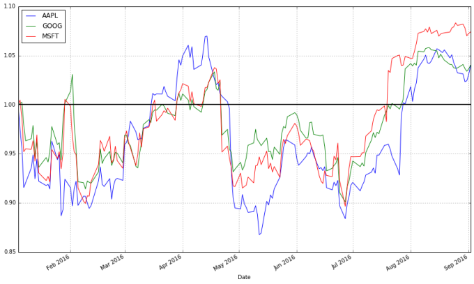
This is a much more useful plot. We can now see how profitable each stock was since the beginning of the period. Furthermore, we see that these stocks are highly correlated; they generally move in the same direction, a fact that was difficult to see in the other charts.
Alternatively, we could plot the change of each stock per day. One way to do so would be to plot the percentage increase of a stock when comparing day $t$ to day $t + 1$, with the formula:
But change could be thought of differently as:
These formulas are not the same and can lead to differing conclusions, but there is another way to model the growth of a stock: with log differences.

(Here, 


We can obtain and plot the log differences of the data in stocks as follows:
# Let's use NumPy's log function, though math's log function would work just as well
import numpy as np

stock_change = stocks.apply(lambda x: np.log(x) - np.log(x.shift(1))) # shift moves dates back by 1.
stock_change.head()
| AAPL | GOOG | MSFT | |
|---|---|---|---|
| Date | |||
| 2016-01-04 | NaN | NaN | NaN |
| 2016-01-05 | -0.025379 | 0.000997 | 0.004552 |
| 2016-01-06 | -0.019764 | 0.001400 | -0.018332 |
| 2016-01-07 | -0.043121 | -0.023443 | -0.035402 |
| 2016-01-08 | 0.005274 | -0.016546 | 0.003062 |
stock_change.plot(grid = True).axhline(y = 0, color = "black", lw = 2)
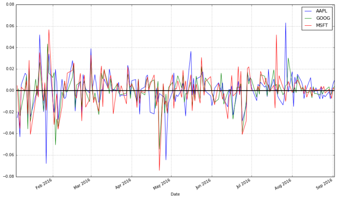
Which transformation do you prefer? Looking at returns since the beginning of the period make the overall trend of the securities in question much more apparent. Changes between days, though, are what more advanced methods actually consider when modelling the behavior of a stock. so they should not be ignored.
Moving Averages
Charts are very useful. In fact, some traders base their strategies almost entirely off charts (these are the “technicians”, since trading strategies based off finding patterns in charts is a part of the trading doctrine known as technical analysis). Let’s now consider how we can find trends in stocks.
A 


Moving averages smooth a series and helps identify trends. The larger
pandas provides functionality for easily computing moving averages. I demonstrate its use by creating a 20-day (one month) moving average for the Apple data, and plotting it alongside the stock.
apple["20d"] = np.round(apple["Close"].rolling(window = 20, center = False).mean(), 2)
pandas_candlestick_ohlc(apple.loc['2016-01-04':'2016-08-07',:], otherseries = "20d")
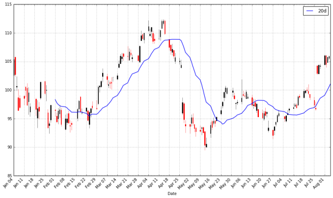
Notice how late the rolling average begins. It cannot be computed until 20 days have passed. This limitation becomes more severe for longer moving averages. Because I would like to be able to compute 200-day moving averages, I’m going to extend out how much AAPL data we have. That said, we will still largely focus on 2016.
start = datetime.datetime(2010,1,1)
apple = web.DataReader("AAPL", "yahoo", start, end)
apple["20d"] = np.round(apple["Close"].rolling(window = 20, center = False).mean(), 2)

pandas_candlestick_ohlc(apple.loc['2016-01-04':'2016-08-07',:], otherseries = "20d")

You will notice that a moving average is much smoother than the actua stock data. Additionally, it’s a stubborn indicator; a stock needs to be above or below the moving average line in order for the line to change direction. Thus, crossing a moving average signals a possible change in trend, and should draw attention.
Traders are usually interested in multiple moving averages, such as the 20-day, 50-day, and 200-day moving averages. It’s easy to examine multiple moving averages at once.
apple["50d"] = np.round(apple["Close"].rolling(window = 50, center = False).mean(), 2)
apple["200d"] = np.round(apple["Close"].rolling(window = 200, center = False).mean(), 2)

pandas_candlestick_ohlc(apple.loc['2016-01-04':'2016-08-07',:], otherseries = ["20d", "50d", "200d"])

The 20-day moving average is the most sensitive to local changes, and the 200-day moving average the least. Here, the 200-day moving average indicates an overall bearish trend: the stock is trending downward over time. The 20-day moving average is at times bearish and at other times bullish, where a positive swing is expected. You can also see that the crossing of moving average lines indicate changes in trend. These crossings are what we can use as trading signals, or indications that a financial security is changing direction and a profitable trade might be made.
Visit next week to read about how to design and test a trading strategy using moving averages.
Update: An earlier version of this article suggested that algorithmic trading was synonymous as high-frequency trading. As pointed out in the comments by dissolved, this need not be the case; algorithms can be used to identify trades without necessarily being high frequency. While HFT is a large subset of algorithmic trading, it is not equal to it.
I have created a video course published by Packt Publishing entitled Training Your Systems with Python Statistical Modeling, the third volume in a four-volume set of video courses entitled, Taming Data with Python; Excelling as a Data Analyst. This course discusses how to use Python for machine learning. The course covers classical statistical methods, supervised learning including classification and regression, clustering, dimensionality reduction, and more! The course is peppered with examples demonstrating the techniques and software on real-world data and visuals to explain the concepts presented. Viewers get a hands-on experience using Python for machine learning. If you are starting out using Python for data analysis or know someone who is, please consider buying my course or at least spreading the word about it. You can buy the course directly or purchase a subscription to Mapt and watch it there.
If you like my blog and would like to support it, spread the word (if not get a copy yourself)! Also, stay tuned for future courses I publish with Packt at the Video Courses section of my site.

Thanks for this! Did you get to fix the weekend gaps in your candlestick charts? I’ve been trying to look for a more elegant solution to this. I want to remove the gaps — weekends and public holidays (when the market is closed). Thanks!
LikeLike
These are not addressed in my charts. I’m not bothered by them, and the best solution would be a line chart interpolating or off-market trading data, wherever you can get it.
LikeLike
In this post only candlestick pattern chart is shown ; it is very hard to find a website or a forum where python code for renko , Three Line break ,point and figure patterns are summarized. Do any one of you have logic and python code for this pattern pls post and feedback to my e ma i l mbmarx gmail com
LikeLike
Great article, thanks for writing! One nitpick though, “High Frequency Trading” is a subset (albeit very large subset) of “Algorithmic Trading”, not another name for it. There is absolutely no reason a trading algorithm has to have high turnover.
LikeLiked by 1 person
I suppose you have a point. I’ll edit this when I can.
EDIT: Fixed on Sep. 23, 2016
LikeLike
Go Utes!
LikeLike
Hello,
The pandas.io.data module is moved to a separate package (pandas-datareader) and will be removed from pandas in a future version.
You need to install pandas-datareader package (https://github.com/pydata/pandas-datareader) using “pip install pandas-datareader“
You will have to change the import “import pandas.io.data as web“ to “from pandas_datareader import data as web“.
Kind regards
LikeLike
Yes, I was aware, but for whatever reason the new code did not work in Jupyter when I tried it, so I left it as is since it still worked for now.
LikeLike
I’m just saying that because with recent Pandas build (v>=0.19) it won’t work anymore because code have been removed (see https://github.com/pydata/pandas/blob/497a3bcbf6a1f97a9596278f78b9883b50a4c66f/pandas/io/data.py )
I suggest installing latest pandas-datareader version from Github using
“pip install git+https://github.com/pydata/pandas-datareader.git“
LikeLiked by 1 person
candlestick_ohlc does no longer exist in matplotlib.finance.
I find another one called candlestick there. However, the generated chart is only black in color.
LikeLike
Sorry, don’t want to obuse some lovers of python, but maybe someone knows anything close to this on Java?
LikeLike
I was wondering the same question…
LikeLiked by 1 person
I would not know. I don’t use Java.
LikeLike
OK, it’s easy to get the data having the ticker symbols. But how do we get the ticker symbols in the first place? If we check the market today we are introducing survivor bias in our analysis. This is the very first step and I’ve been having trouble with it so far. Thank you.
LikeLike
I did some searching and it’s possible what you are asking for cannot be done with the APIs and packages used here. You may need to go to the exchange of interest (I.e. NASDAQ, NYSE etc.) and find the list, perhaps in a CSV file.
LikeLike
HI
How will I get the prices for gold, crudeoil and other commodities. Can we get it from yahoo.
LikeLike
Look for ETFs that track commodities. For example, the SPDR ETF with ticker symbol “GLD” should track closely to a gold index.
LikeLike
Thanks.. How can I write the code same like apple = web.DataReader(“AAPL”, “yahoo”, start, end) for Oil and gold
LikeLike
For those of who don’t want a simpler version of the candlestick code, might I suggest you look into plotly, I got the same result with only about 6 lines of code. It did take a few hours of experimenting to get those six lines working, however.
LikeLike
I meant to say, those of you who do want a simpler version of code, to look into plotly’s candlestick capability
LikeLike
This is exactly the knowledge I’ve been trying to find. I’ve taken about 8 MOOC’s trying to find information that was concise and straight to the point, like your posts. Thank you very much for making my quest for writing financial strategies SO much easier. Please post more on this subject whenever you have time, or if you already have more information posted, could you leave me a link pointing me towards the site(s)???
LikeLiked by 2 people
I don’t have any more posts on finance data analysis. I REALLY want to write more for my blog (and I probably would write more on financial topics, if I could think up some; requests are welcome), but I tend to be very busy these days. But thank you for your kind words. 🙂
LikeLike
Hi Curtis,
I am following the tutorial you put up for R here: https://www.r-bloggers.com/an-introduction-to-stock-market-data-analysis-with-r-part-1/. I got to this part :
if (!require(“magrittr”)) {
install.packages(“magrittr”)
library(magrittr)
}
## Loading required package: magrittr
stock_return % t % > % as.xts
head(stock_return)
But, I keep getting this error –
Error: unexpected ‘>’ in “stock_return % t % >”
Please how do I resolve this?
LikeLike
If you’re following that tutorial, maybe post this comment to that blog post? Anyway, there was a bug in the original code. The post has been updated.
LikeLike
Thanks for the post !
In this post and the second part, the moving average is computed by using the ‘Close’ price, why not use the ‘Adj Close’ directly ? such that in the second part, when we compute the profit, we don’t need to adjust there ?
LikeLike
Line
apple[“20d”] = np.round(apple[“Close”].rolling(window = 20, center = False).mean(), 2)
[b]TypeError: round() takes at most 2 arguments (3 given)[/b]
i am using 2.7
Thanks.
—————————————————————————
TypeError Traceback (most recent call last)
in ()
—-> 1 apple[“20d”] = np.round(apple[“Close”].rolling(window = 20, center = False).mean(), 2)
2 #pandas_candlestick_ohlc(apple.loc[‘2016-01-04′:’2016-08-07′,:], otherseries = “20d”)
F:\Program Files\Anaconda2\lib\site-packages\numpy\core\fromnumeric.pyc in round_(a, decimals, out)
2784 except AttributeError:
2785 return _wrapit(a, ’round’, decimals, out)
-> 2786 return round(decimals, out)
2787
2788
TypeError: round() takes at most 2 arguments (3 given)
LikeLike
ok i change the code. You mat delete the comment sorry.
apple[“20d”] = apple[“Close”].rolling(window = 20, center = False).mean().round(2)
LikeLike
This is a great tutorial, thank you for sharing. For anyone getting the following error:
“NameError: name ‘date2num’ is not defined”
I got around it by changing ‘date2num’ to ‘mdates.date2num’ and it worked.
LikeLiked by 2 people
Hi, I have still not been able to work around this….can you help
LikeLiked by 2 people
Try
import matplotlib.dates as mdates
then use mdates.date2num
LikeLike
Wow, awesome code there, just had to copy it to python and try to run it. As soon as I ran the code I got this error message:
File “main.py”, line 16
%matplotlib inline
^
SyntaxError: invalid syntax
exited with non-zero status
It came from this section of the code:
import matplotlib.pyplot as plt # Import matplotlib
# This line is necessary for the plot to appear in a Jupyter notebook
%matplotlib inline
# Control the default size of figures in this Jupyter notebook
%pylab inline
pylab.rcParams[‘figure.figsize’] = (15, 9) # Change the size of plots
Can someone please help me out here, would definitely like to use this as example for other prediction models for stocks and commodities.
Cheers!
LikeLike
The line is an IPython magic function, which does not work in vanilla Python. Run in an IPython environment, like a Jupyter Notebook, or erase the calls to magic functions (but I make no promises about how the program will function if you do).
LikeLike
I simply commented out those lines. The pandas_candlestick_ohlc function works! Lovely. Thank you for this tutorial.
LikeLike
Python shell requires a specific plot.show(). So after commenting out the magic IPython IDE specific commands (%…) try this –
apple.plot(grid – True)
plt.show()
LikeLike
Unable to get data from Yahoo. Can you please share the link for CSV file?
LikeLike
Yahoo! Finance no longer works. Replace source with “google” you’ll be good to go, but there will be a lot of stuff from these tutorials that won’t apply since Google only adjusts for stock splits.
LikeLike
Hi Curtis,
I am happy to find this post. Thanks for your effort. I am a market technician (old school, price action / pattern trader) and profitable , but I miss too many opportunities in the market to make more money cause I dont know how to code.
So, after learning the basics of MatLab language, and doing my due diligence, I decided to change and learn Python.
My question is, If I want to use time series (10 years of daily data, high, open, close and low price, plus volume) to scan 4,000 stocks in a weekly basis. How exactly should I learn Python? I read about Panda (AQR capital management recommends it) in this post and other ones, and I also found that you use matplotlib, and other things, which I dont have a clue. And I struggled when I tried to download Python a week ago from their website. I also tried https://jupyter.org/ to learn the very basics, but it seems that it would not work for what i want.
My goal is to develop my proprietary trading software for swing trading using my trading style. If you can put some links or shed some light to understand this world. I would appreciate it !
Thanks a lot! keep the good work
BisTec
LikeLike
Gerat article, thanks for sharing this!
LikeLike
Hello, I am a year 10 student, doing an extension project about coding a stock exchange monitor. I wanted to know if I could use your code as a base for my program, and if you had any other resources for stock exchange coding in python.
Thanks.
LikeLike
So long as you cite me in at least the comments and your report, go for it. Best of luck, and feel free to share what you do in the comments.
I’ve written other blog posts about using Python for finance. Some books on my reading list include Python for Finance by Yves Hilpisch and Mastering Python for Finance by James Ma Weiming. I would also recommend Wes McKinney’s Python for Data Analysis since he writes a lot about pandas (which he initially created) and pandas is very useful for finance (that’s the package’s original use case). I learn a lot by reading the tutorials developers of interesting packages write. If you’re interested in algo trading, consider the tutorials for the zipline package or backtrader. I have written a getting started post on backtrader and that is my preferred algo trading and backtesting package.
LikeLike
Hi,
This very nice example . But when i tried to get the symbol historical data by pandas_datareader for NSE (Indian Stock exchange) i got error . even i have used NSE as exchange name it is not working
INFY = web.DataReader(“NSE;INFY”, “yahoo”, start, end).
Kindly help me understand how i can download NSE exchange historical data.
Regards
Purushottam
LikeLike
No clue about Indian data.
LikeLike
To get indian stock market data you may want to install package “nsepy”. Please google it and you will get details on it.
LikeLike
Great tutorial thanks for sharing 🙂
LikeLike
Thank you very much, this very helpful
LikeLike
Hi,
I am getting lots of error in “def pandas_candlestick_ohlc” in candlestick chart creation. Can you please fix.
Thanks & regards
LikeLike
Reblogged this on Blog and commented:
Decent intro to Python
LikeLike
Thank you for posting this.
LikeLike
Morningstar premium API
http://morningstar-api.herokuapp.com/analysisData?ticker=WMT
LikeLike
This was great thanks for sharing!
I am a little lost as to how your moving averages trend lines seem to follow the same time span as your candlestick chart data. Can you please help me understand how you did this? Thanks!
LikeLike
Drawing trend lines is one of the few easy techniques that really WORK. Prices respect a trend line, or break through it resulting in a massive move. Drawing good trend lines is the MOST REWARDING skill.
The problem is, as you may have already experienced, too many false breakouts. You see trend lines everywhere, however not all trend lines should be considered. You have to distinguish between STRONG and WEAK trend lines.
One good guideline is that a strong trend line should have AT LEAST THREE touching points. Trend lines with more than four touching points are MONSTER trend lines and you should be always prepared for the massive breakout!
This sophisticated software automatically draws only the strongest trend lines and recognizes the most reliable chart patterns formed by trend lines…
http://www.forextrendy.com?kdhfhs93874
Chart patterns such as “Triangles, Flags and Wedges” are price formations that will provide you with consistent profits.
Before the age of computing power, the professionals used to analyze every single chart to search for chart patterns. This kind of analysis was very time consuming, but it was worth it. Now it’s time to use powerful dedicated computers that will do the job for you:
http://www.forextrendy.com?kdhfhs93874
LikeLike
In case anyone is running into trouble with Yahoo Finance… it has since been deprecated. https://intrinio.com seems to be a great alternative, though.
LikeLike
This is why I want people to use this article instead: https://ntguardian.wordpress.com/2018/07/17/stock-data-analysis-python-v2/
LikeLike